Yehia Moldan
The Front Line
After studying linguistics, Yehia Moldan decided to train as agraphic designer. He became interested in logos and their mix of functionality and aesthetics. After growing up in Gaza, he moved to Europe where Arabic became an increasingly important part of his identity. This led to his current and biggest project, which is inspired by Arabic typography. Its elegant calligraphy and plentiful varieties of words and dialects have proved an inexhaustible source of inspiration.
For his ongoing project, The Front Line, Moldan was influenced by Viking and Amazigh types, and Nasri Khattar, a Lebanese architect and the father of 'unified Arabic’. This system of Arabic typography was designed by Khattar in the 1930s to be easier to learn. By extracting ligature forms and multiple vocalisation marks, he created a simplified alphabet that allowed Arabic letters to be used on typewriters. In doing so, he contributed to the fight against illiteracy in the Levant. For some, however, the whole idea was seen as a concession to Western standards and language culture, and Khattar’s alphabet more successful in New York, where Khattar worked as an architect, than in Egypt, where he first proposed the project.
Moldan does not see his work as revolutionary or educational, unlike many of the countless attempts to simplify Arabic typography in the past. Rather, he believes the success his projects encounter onInstagram – where he now has almost 90,000 followers – to be the result of their suitability to the medium’s format. He regularly posts new designs inspired by Arabic typography, which, according to the app’s analytics, are seen mainly by followers located in what Instagram recognizes as Israel. This the artist says, is proof of the power of language and design to transcend political borders.
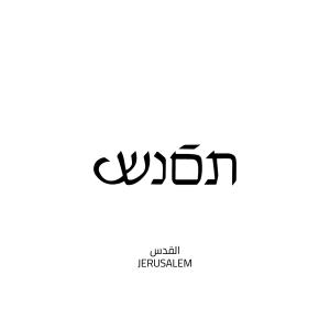
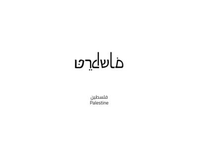
HEBREW-ARABIC
‘This work is an attempt to interrupt the tools of the oppressor. In this case, I use the Hebrew alphabet to write Arabic words, which are impossible to read by the oppressor unless they know the language . It’s a way of paralyzing them in their own authority. For Palestinians though, it’s super easy to read, and fun, too, as it’s simply different Arabic typography. It’s a shame that such an innocent creature as language can be used to kill facts, fake history, and support ethnic cleansing. This work is an attempt to save the Hebrew alphabet from Zionism.’
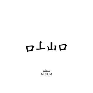
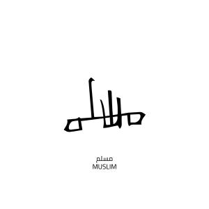
‘Writing the word Muslim in Arabic typography using the Chinese alphabet is a way of demonstrating against the systematic discrimination against Muslim minorities that is going on in China. This post came as a response to the revelations about the workings of China’s detention camps in Xinjiang.’
Yehia Moldan is a freelance graphic designer. Over the past three years, his work has established him as an Arabic typographer with a unique approach. His modern and minimalist style also incorporates aspects of the Amazigh alphabet, traditional Bedouin tattoo designs, the Latin alphabet, and Viking symbolism.
Interview by Clara Wouters